
For 12 years, this playbook was developed and used by me inside one of the UK’s major direct response publishers.
It was never taught outside it.
The Design Playbook Behind 100+ Successful Direct Response Launches, Now Open to First-Time Creators
Turn Your Word Document Into a Complete, Professional Product Launch. Book, Cover, Mockups, Sales Page, Checkout. With Free Design Tools. Without Being a Designer.
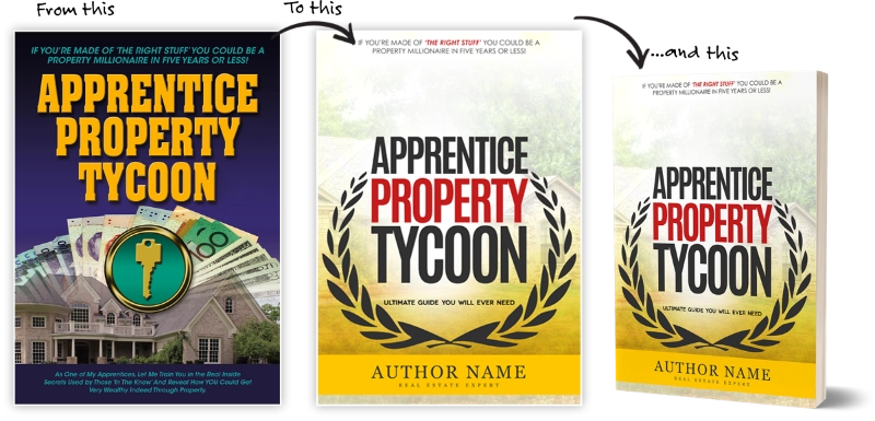
For 12 years, I turned Word documents into finished launches, 100+ times. This is the exact process, step by step, plus an art director that checks your work before anyone else sees it.
Founder’s price $27 until launch ends (then $67) · 82-page illustrated PDF + POLISH Assistant
30-day money-back guarantee
Before I Say Anything Else, Here’s Some Of The Work I Did
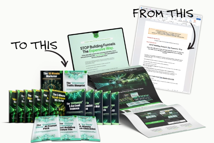
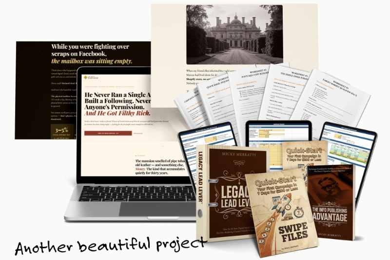
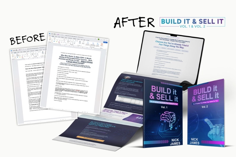
Even the covers, 3D mockups and sales page you’re reading right now were built with the same 6 steps and the same free tools you’ll use.
You’ve Probably Never Heard
My Name
The publishers’ names go on the promotions. The designers stay behind the curtain.
For 12 years, I was behind that curtain. I wasn’t for hire. Not to freelance clients, not to agencies, not to anyone else. Every cover, every 3D mockup, every sales page I made went to one place: that major UK publisher whose entire business is selling information products through direct response, online and offline.
It’s the kind of company where a launch is judged by its numbers, not by whether people like how it looks. Where the marketers have seen thousands of promotions and can tell in seconds when something looks cheap. I designed for more than 100 of their launches.
In a room like that, you don’t get to guess. You learn what makes a buyer trust a product before they read a single word, by watching what works and what gets thrown out, launch after launch.
Now I work independently, so for the first time I get to choose who I share it with. I’m starting with the people who were never invited into those rooms: first-time creators with a book or an idea and no design team behind them.
You Can See It Too, Can’t You?
The pain you already know
You put your cover next to a bestseller on Amazon, and yours suddenly looks cheap.
You’re not the only one who’s felt it
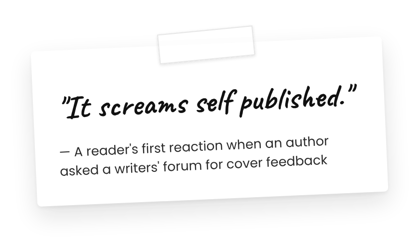
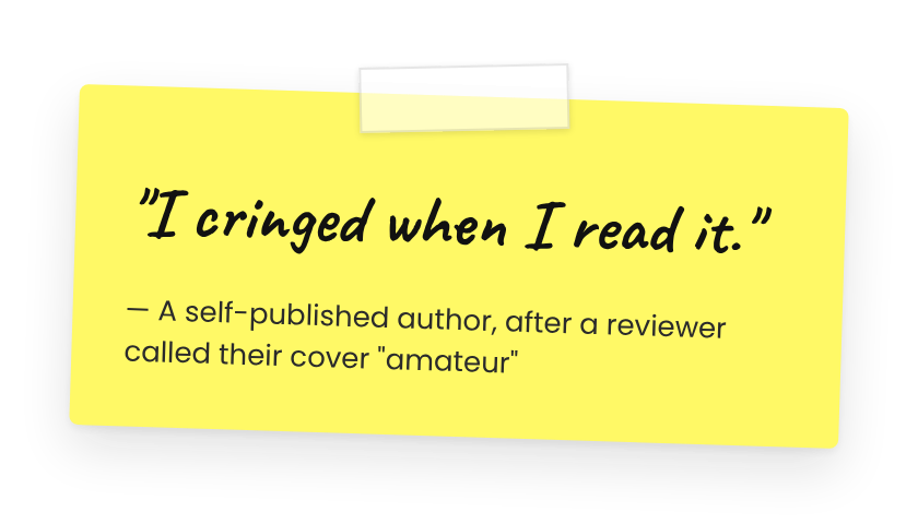
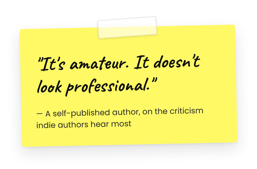
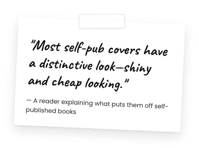
Real comments from self-published authors and readers on Goodreads and writing forums.
You can’t say exactly why. The font? The colors? The picture? You’ve changed all three. You’ve tried a Canva template. Maybe you asked ChatGPT or Midjourney for a cover and loved it for a day, until you started seeing the same glossy look everywhere.
The cost you haven’t counted
Buyers don’t read your book before they decide whether to trust it.
50ms
Research on first impressions found that people judge a web page’s (and even a book cover’s) visual appeal in roughly 50 milliseconds.
(Lindgaard et al., 2006)
That’s faster than they can read your title. Professional publishers know this, which is why their launches go through a designer. Most first-time creators launch without one, and their months of writing get judged by the 3 things they spent the least time on: the cover, the mockup and the first screen of the sales page.
Try this right now: the Thumbnail Test
Open your cover on your phone and shrink it to the size of an Amazon search result. Can you read the title in one second? Does anything tell you what the book is about?
If not, that’s what buyers see too, and it’s fixable.
See it fixed in 90 seconds
That’s the POLISH Assistant, the art director that comes free with the course. More on it below.
This isn’t your fault
Three things are working against you:
Templates.
Thousands of people use the same Canva layouts, so yours blends in.
The AI flood.
AI covers are everywhere now, and buyers have learned to spot them.
Nobody teaches packaging.
Writing courses teach writing. Design courses assume you want to become a designer. The people who know how to package a product to sell work in-house, and they don’t teach.
You weren’t bad at this. You were judged on a test nobody outside the industry was shown how to pass.
Why the Usual Fixes Keep
Letting You Down
Approach
How It Works
Why It Fails
Canva templates
Pick a template, swap in your title
Thousands used the same one, and it won’t match your mockups or sales page
AI cover generators
Type a prompt, get a glossy image
Buyers recognize the AI look. AI makes the picture, but it doesn’t decide what buyers should notice first
Cheap marketplace designer
Pay for a single cover
One file. No mockups, no sales page, no matching style, no idea how to fix it later
“Just make great content”
Keep improving the book
Buyers leave before the content is judged
The POLISH Method
The in-house process: one planned look → book, cover, mockups and sales page built from it, every piece reviewed
Why it wins: It’s how professional publishers do it, simplified for one person with free design tools
Canva templates
How It Works
Pick a template, swap in your title
-
Why it fails
Thousands used the same one, and it won’t match your mockups or sales page
AI cover generators
How It Works
Type a prompt, get a glossy image
-
Why it fails
Buyers recognize the AI look. AI makes the picture, but it doesn’t decide what buyers should notice first
Cheap marketplace designer
How It Works
Pay for a single cover
-
Why it fails
One file. No mockups, no sales page, no matching style, no idea how to fix it later
“Just make great content”
How It Works
Keep improving the book
-
Why it fails
Buyers leave before the content is judged
The POLISH Method
How It Works
The in-house process: one planned look → book, cover, mockups and sales page built from it, every piece reviewed
-
Why it wins
It’s how professional publishers do it, simplified for one person with free design tools
What 100+ Launches Taught Me About Looking “Real”
Doing that many launches teaches you something one project can’t: professional-looking products follow the same pattern every time, in the same order.
Beginners start on the cover. Inside a publishing house, the cover is step 3.
So I wrote down the order I followed, one letter for each step.

P
P — Plan Your Look
Choose a title that sells and the colors and fonts your market expects, then put them on a one-page style guide. In-house, nothing gets designed before this is decided. Beginners skip it, and that’s why their cover, mockups and sales page look like 3 different products.
O
O — Open Your Free Toolkit
Set up Photopea, Affinity (free through a Canva account) and Claude, learning only what a beginner needs. Then clean up your Word manuscript and lay out the inside of your book in Affinity, at standard Amazon KDP sizes, so it reads like a real book, not a printed Word file.
L
L — Lay Out a Cover That Sells
Learn cover anatomy, hierarchy, and the mistakes that scream “homemade.” Then build a complete cover step by step, using AI as a helper without the AI look.
I
I — Illustrate It in 3D
Turn your flat PDF into a 3D cover, a bundle shot and a mockup set with free templates. This is the step that makes a digital product look like something you could hold, and the one beginners most often skip.
S
S — Sell It on the Page
Sales page structure, copy basics with Claude as your helper, and the visual design that makes a page feel professional. The biggest lesson, because this is where sales are won or lost.
H
H — Hit Publish
Domain, hosting, page builder, checkout and email, explained step by step with a budget route and an all-in-one route, the real costs of each, and a pre-launch checklist so you go live knowing every piece works.
Each step builds on the one before. Your style guide (P) drives your cover (L), your cover drives your mockups (I), and your mockups sell on your page (S). That consistency is what makes buyers think “this is a real product.”